A Gallery Page that Sets Expectations
- Christopher. H

- Oct 23, 2025
- 4 min read
Updated: Jan 20
A Gallery Page speaks before a word is read.
It shows what you’re capable of and sets expectations in an instant.
People use this page to decide whether your work feels credible, relevant, and worth exploring further. Clear visuals, thoughtful grouping, and simple context help visitors understand what they’re looking at and why it matters. When the presentation feels considered, trust builds naturally.
This page works quietly in the background. It supports enquiries, reinforces confidence, and helps people picture themselves working with you. The way your work is displayed shapes how your business is perceived.
Designed with care, a gallery page turns visual proof into confidence and gives visitors a reason to take the next step.

What Exactly Is a Gallery Page?
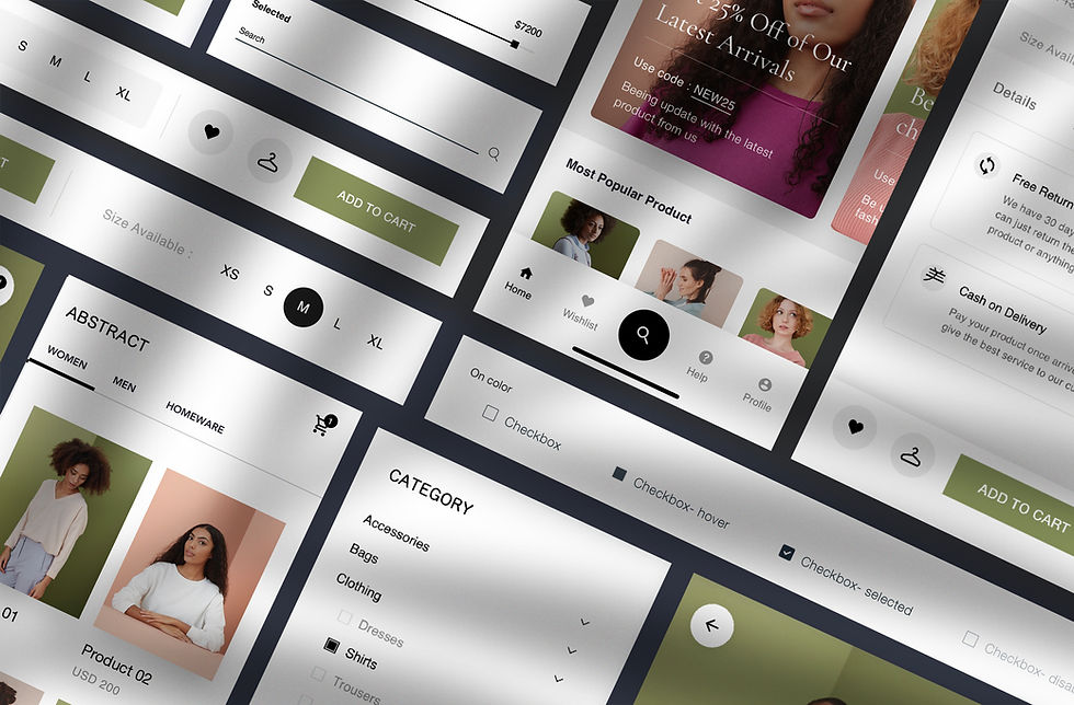
A Gallery Page is a curated collection of visual proof — photos, graphics, or video — that demonstrates the outcomes of your work.
It is not an image dump.
It is a guided experience.
A strong Gallery Page helps visitors understand:
what you do
the quality you deliver
the types of outcomes you create
Core elements usually include:
grouped image categories (so visitors can navigate by relevance)
short captions providing context or results
a clear call-to-action (enquire, book, buy, or view more)
Optional features that elevate performance:
lightbox viewing for distraction-free browsing
category filters by service, industry, or project type
hover labels for quick cues like “Before / After” or “Starting from $X”
Together, these turn visuals into evidence — not decoration.
Why This Page Matters
A Gallery Page isn’t really about aesthetics.
It’s about reassurance.
People want to see proof before they commit. Real work removes doubt faster than any paragraph ever could.
A well-built gallery:
builds trust instantly through real examples
increases enquiry rates by showing outcomes clearly
supports upsells through captions and context
educates customers with before/after or process visuals
strengthens credibility with investors, partners, and buyers
provides reusable content for sales and marketing
signals momentum by showing active, recent work
Without this page, you rely on explanation.
With it, the work speaks for itself.
The effectiveness of this page depends on one thing: knowing what your customer actually cares about — and showing that, not everything.
Before You Start
Before uploading anything, get these right:
select only your strongest work (quality over volume)
group visuals into clear, logical categories
write short captions explaining why the image matters
decide your primary call-to-action
optimise images for fast loading
test mobile layouts thoroughly
confirm usage rights for client work
A Gallery Page is curated proof, not an archive.

How to Build a Gallery Page:
Step by Step
Step 1: Plan Your Layout
Pick a clean design (grid, masonry, carousel).
Decide where the gallery sits in your site structure.
Ensure it matches your brand look.
Result: A consistent, professional foundation.
Step 2: Upload and Categorise Images
Group visuals into categories.
Use labels like “Residential,” “Corporate,” “Ecommerce Products.”
Limit each category to your best 5–10 visuals.
Result: Visitors can quickly find relevant proof.
Step 3: Add Captions and Context
Write 1–2 lines under each image.
Explain the outcome or customer value.
Add “before/after” or results where relevant.
Result: Images become sales tools, not just decoration.
Step 4: Integrate Interactive Features
Enable lightbox viewer for easy browsing.
Add filters so users can sort.
Use hover labels for quick insights.
Result: Smooth UX increases engagement.
Step 5: Place Your CTA
Add “Book Now,” “Request a Quote,” or “Buy This” below or alongside the gallery.
Link to contact forms, checkout, or booking systems.
Result: Clear next step drives conversions.
Step 6: Optimise for Speed and Mobile
Compress files.
Test loading time.
Check responsiveness on different devices.
Result: Fast and accessible experience for every visitor.
Step 7: Refresh Regularly
Rotate out old visuals.
Add new projects or products quarterly.
Result: Your gallery stays current and credible.
Mentors Tip:
Your gallery should always tie proof back to action.
Together, these steps turn a static page into a living asset.

Where Gallery Pages Commonly Go Wrong
Most issues come from excess, not lack.
Common mistakes include:
uploading too many images with no structure
relying on stock photography instead of real work
missing captions that explain relevance
forgetting to include a clear CTA
ignoring mobile behaviour
When galleries overwhelm or confuse, people disengage quietly.
What It Costs and How Long It Takes
You’ll need to budget for both money and time.
DIY / In-house: $0–$200 AUD | 6–8 hours | Use CMS templates; cost is mainly time.
Template/Resource: $50–$300 AUD | 2–4 hours | Wix has templates
Professional / Done-for-you: $1,000–$4,000 AUD | 1–3 weeks | Custom gallery design with UX/UI polish.
Mentor Tip
Always showcase fewer, higher-quality visuals. Curation builds trust; clutter kills it.
When It Makes Sense to Get Help
If your gallery looks good but doesn’t generate enquiries, the issue is usually structure — not quality.
Building this page properly isn’t about visual polish.
It’s about showing the right proof, in the right order, with a clear path forward.
Support Options
Business Growth Agency | Noize
We design Gallery Pages that convert visual proof into confidence — with structure, captions, and calls-to-action that actually move people.
Startup Mentorship, at Your Fingertips | The Startup Deck
Frameworks for deciding what to show, how to show it, and how to turn proof into pipeline.
Intuitive Business Ecosystem | ProDesk
Organise assets, permissions, categories, and updates so your gallery evolves as your business grows.
COMING SOON…
Download the Gallery Builder Kit
Image Curation Grid, Caption Writing Framework, Category Map Template, Visual Compression Checklist, and CTA Placement Guide — built to help your gallery work as hard as the rest of your site.

The Bottom Line
Your Gallery Page is one of the highest-leverage parts of your site. Get it wrong, and you look like everyone else. Get it right, and you have a 24/7 salesperson building trust and driving action.
Every visitor is asking: “Can they really deliver?” Your gallery answers with a resounding yes.
FAQs
Do I really need captions?
Yes. Without captions, images are just decoration. Captions turn them into proof and persuasion.
How many images should I include?
Start with 10–20 of your best. Expand only if it adds clarity, not clutter.
Should I add video?
A short highlight reel works brilliantly. Keep it under 90 seconds.
What about load speed?
Compress images, use WebP, and test with tools like Google PageSpeed.
Can I show client work?
Yes, but always get written permission. Even better—pair it with a testimonial.


Comments