Optimise Your Cart and Checkout Page to Maximise Conversions
- Simon. P

- Oct 22, 2025
- 5 min read
Updated: Jan 19
Protect the Moment People Are Ready to Buy
Someone has already decided.
They’ve chosen the product. They’ve committed the time. They’re one step away.
This is where momentum either carries through — or quietly disappears.
A cart and checkout page works best when nothing interrupts that moment. Prices are clear. The next step is obvious. The process feels familiar enough that no extra thought is required. When that happens, people complete the purchase without hesitation.
This page isn’t about persuasion.It’s about protecting intent.
When the path is short and the experience feels steady, buying becomes the easiest thing to do.

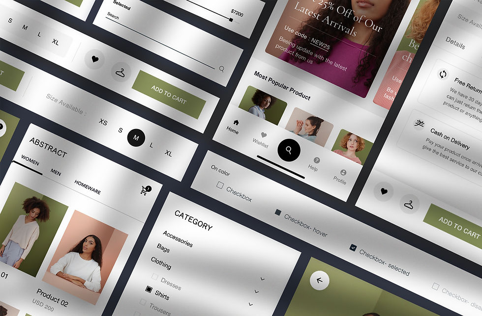
What Is a Cart and Checkout Page?
The cart and checkout page is the final stage of your online shop — where customers review their order, enter payment details, and complete the purchase.
It’s the handover point between interest and revenue.
Most effective checkouts include:
A clear product summary
Quantity and pricing visibility
Shipping options and costs
Payment fields
Optional promo code field
A clear call to complete the purchase
Extra elements that often improve completion:
A sticky CTA button
Auto-updating totals
A simple progress indicator (for multi-step checkouts)
Trust signals such as payment provider logos and security cues
The goal is simple: remove anything that causes doubt or delay.
What Makes a Good Cart and Checkout Page
A good checkout page feels familiar, calm, and predictable.
Customers shouldn’t need to learn anything new at this point — they should simply follow through.
Strong checkout pages usually have:
Clear order visibility
Products, quantities, prices, and totals are easy to review without scrolling or guessing.
Minimal steps
Fewer pages and fewer fields reduce hesitation. One-page checkouts consistently outperform complex flows.
Upfront costs
Shipping, taxes, and fees are shown early. Surprises late in the process cause abandonment.
Multiple payment options
Card, digital wallets, and buy-now-pay-later options reduce friction.
Obvious next action
The primary button stands out and clearly communicates the final step.
Trust signals at the point of payment
Security cues, payment logos, and guarantees appear exactly where customers pause.
When these elements are in place, checkout stops feeling like a decision point and starts feeling like a formality.
Why This Page Can Make or Break Revenue
Checkout is where most online revenue is lost.
Common impacts of poor checkout design include:
Abandoned carts from unnecessary steps
Drop-off caused by forced account creation
Loss of trust when security cues are missing
Frustration from hidden shipping costs
Even small improvements here can lift conversion rates significantly — because the intent already exists.
This page doesn’t create demand.It either captures it or leaks it.
Before You Build or Change Anything
Have these ready first:
Product summary layout (image, title, price)
Shipping methods and pricing
Payment gateways (Stripe, PayPal, Afterpay, etc.)
Promo code rules
Final CTA copy
Trust badges or guarantees
Decision on one-page vs multi-step checkout
Preparation reduces mistakes at launch.

How to Optimise Cart and Checkout:
Step by Step
Step 1: Simplify the Cart Layout
Display product image, title, price, and quantity clearly.
Show totals updating automatically.
Add an “Edit” option without forcing a full restart.
Result: Customers feel in control before paying.
Step 2: Design a One-Page Checkout (if possible)
Combine shipping, payment, and confirmation on one page.
Only ask for essential info.
Keep forms short.
Result: Fewer steps = more completed purchases.
Step 3: Add Payment and Shipping Options
Offer multiple payment choices (card, PayPal, BNPL).
Include flexible shipping speeds.
Display estimated delivery dates.
Result: Customers choose what suits them best.
Step 4: Include Promo Code Field and CTA
Add a clear field for discount codes.
Place a bold CTA button (“Finalise Your Purchase”)—make it sticky.
Result: You encourage faster action and prevent hesitation.
Step 5: Build Trust with Icons and Confirmation
Display SSL, payment provider logos, and money-back guarantee.
Redirect to a thank-you page after purchase.
Result: Customers trust you and feel reassured post-purchase.
Together, these steps turn checkout into a smooth finish instead of a last-minute roadblock.

Where Checkout Commonly Goes Wrong
Most issues come from unnecessary friction.
Common mistakes include:
Too many steps or pages
Forced account creation
Hidden costs revealed late
Missing security or payment cues
Each extra decision point increases the chance of abandonment.
When It’s Time to Invest in Getting This Built Properly
Checkout sits at the most commercially sensitive point of your website.
Performance here depends on more than visuals. Page speed, form logic, mobile behaviour, payment integrations, SEO foundations, and how checkout connects to the rest of the site all influence completion rates.
When this is built by people who understand growth systems — not just page design — it pays for itself. A well-built checkout increases conversion, reduces abandonment, and protects revenue that’s already been earned.
This isn’t a design upgrade.
It’s revenue protection.
What It Costs and How Long It Takes
Here’s what founders usually face:
DIY / In-house: $0–$50 AUD; 2–4 hours. Using built-in checkout options from Shopify/WooCommerce.
Template/Resource: $50–$200 AUD; 2–3 hours. Pre-built one-page checkout templates.
Professional / Done-for-you: $500–$2,500 AUD; 1–2 weeks. A designer customises a branded checkout experience.
Mentor Tip:
Always keep checkout one-page if possible—fewer steps equal more conversions.
What You Can Do Next
✅ Done-For-You for Checkout Pages— Stop leaks at the finish line. We design checkout and cart pages that keep buyers moving — faster load times, fewer fields, and clear trust signals built in. You handle the product; we’ll make sure every click counts. Noize.com.au
✅ Your checkout isn’t a form — it’s a moment of truth. The StartupDeck helps you with layouts and structure for your web pages, like the checkout or cart, so you can close sales confidently.
COMING SOON...
✅ Grab the Checkout Optimiser Kit.
Build a checkout that converts browsers into buyers, using a Cart Flow Map, Trust Badge Placement Guide, Field Simplification Sheet, Payment Option Grid, and Abandonment Recovery Script. Available to download on [ProDesk.com]

The Bottom Line
Your cart and checkout page is where money changes hands. If it’s complicated, you’re leaving revenue on the table.
A clean, trustworthy, one-page checkout creates momentum and confidence. Every extra click you remove increases sales.
For founders in their first five years, this is one of the most critical optimisations you can make.
FAQs
Do I really need a one-page checkout?
If possible, yes. One-page checkouts consistently outperform multi-step versions.
Should I offer multiple payment options?
Yes. Customers expect at least card and PayPal. BNPL is a plus.
Do promo code fields hurt conversions?
Not if they’re discreet. Just don’t make shoppers hunt for codes offsite.
What trust icons should I use?
SSL padlock, credit card logos, PayPal, Afterpay, and any relevant guarantees.
Should totals update automatically?
Yes. Auto-updating totals build transparency and reduce cart abandonment.

Comments